4.1 Time series plots
Time series plots are an excellent way to begin the process of understanding what sort of process might have generated the data of interest. Traditionally, time series have been plotted with the observed data on the \(y\)-axis and time on the \(x\)-axis. Sequential time points are usually connected with some form of line, but sometimes other plot forms can be a useful way of conveying important information in the time series (e.g., bAR_p_coeflots of sea-surface temperature anomolies show nicely the contrasting El Niño and La Niña phenomena).
4.1.1 ts objects and plot.ts()
The CO\(_2\) data are stored in R as a data.frame object, but we would like to transform the class to a more user-friendly format for dealing with time series. Fortunately, the ts() function will do just that, and return an object of class ts as well. In addition to the data themselves, we need to provide ts() with 2 pieces of information about the time index for the data.
The first, frequency, is a bit of a misnomer because it does not really refer to the number of cycles per unit time, but rather the number of observations/samples per cycle. So, for example, if the data were collected each hour of a day then frequency = 24.
The second, start, specifies the first sample in terms of (\(day\), \(hour\)), (\(year\), \(month\)), etc. So, for example, if the data were collected monthly beginning in November of 1969, then frequency = 12 and start = c(1969, 11). If the data were collected annually, then you simply specify start as a scalar (e.g., start = 1991) and omit frequency (i.e., R will set frequency = 1 by default).
The Mauna Loa time series is collected monthly and begins in March of 1958, which we can get from the data themselves, and then pass to ts().
## create a time series (ts) object from the CO2 data
co2 <- ts(data = CO2$ppm, frequency = 12, start = c(CO2[1, "year"],
    CO2[1, "month"]))
Now let’s plot the data using plot.ts(), which is designed specifically for ts objects like the one we just created above. It’s nice because we don’t need to specify any \(x\)-values as they are taken directly from the ts object.
## plot the ts
plot.ts(co2, ylab = expression(paste("CO"[2], " (ppm)")))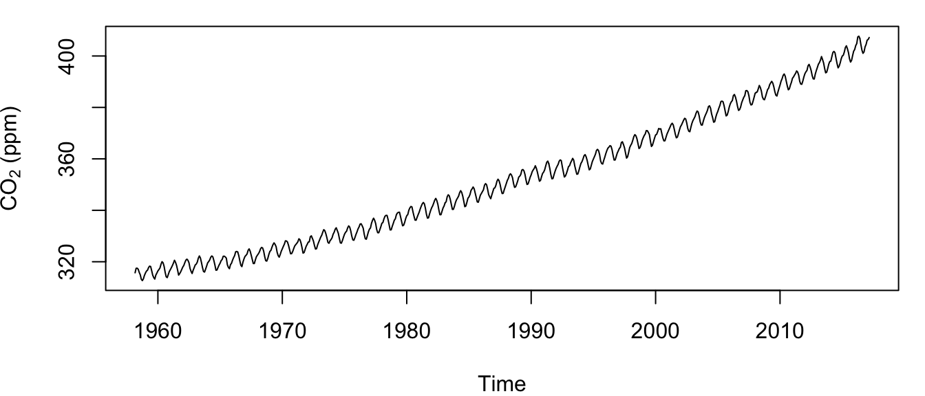
Figure 4.1: Time series of the atmospheric CO\(_2\) concentration at Mauna Loa, Hawai’i measured monthly from March 1958 to present.
Examination of the plotted time series (Figure 4.1) shows 2 obvious features that would violate any assumption of stationarity: 1) an increasing (and perhaps non-linear) trend over time, and 2) strong seasonal patterns. (Aside: Do you know the causes of these 2 phenomena?)
4.1.2 Combining and plotting multiple ts objects
Before we examine the CO\(_2\) data further, however, let’s see a quick example of how you can combine and plot multiple time series together. We’ll use the data on monthly mean temperature anomolies for the Northern Hemisphere (Temp). First convert Temp to a ts object.
temp_ts <- ts(data = Temp$Value, frequency = 12, start = c(1880,
    1))
Before we can plot the two time series together, however, we need to line up their time indices because the temperature data start in January of 1880, but the CO\(_2\) data start in March of 1958. Fortunately, the ts.intersect() function makes this really easy once the data have been transformed to ts objects by trimming the data to a common time frame. Also, ts.union() works in a similar fashion, but it pads one or both series with the appropriate number of NA’s. Let’s try both.
## intersection (only overlapping times)
dat_int <- ts.intersect(co2, temp_ts)
## dimensions of common-time data
dim(dat_int)
[1] 682 2## union (all times)
dat_unn <- ts.union(co2, temp_ts)
## dimensions of all-time data
dim(dat_unn)[1] 1647 2As you can see, the intersection of the two data sets is much smaller than the union. If you compare them, you will see that the first 938 rows of dat_unn contains NA in the co2 column.
It turns out that the regular plot() function in R is smart enough to recognize a ts object and use the information contained therein appropriately. Here’s how to plot the intersection of the two time series together with the y-axes on alternate sides (results are shown in Figure 4.2):
## plot the ts
plot(dat_int, main = "", yax.flip = TRUE)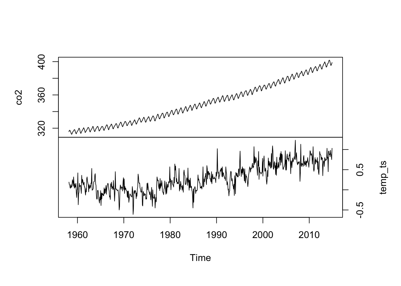
Figure 4.2: Time series of the atmospheric CO\(_2\) concentration at Mauna Loa, Hawai’i (top) and the mean temperature index for the Northern Hemisphere (bottom) measured monthly from March 1958 to present.