5.2 Stationarity
It is important to test and transform (via differencing) your data to ensure stationarity when fitting an ARMA model using standard algorithms. The standard algorithms for ARIMA models assume stationarity and we will be using those algorithms. It possible to fit ARMA models without transforming the data. We will cover that in later chapters. However, that is not commonly done in the literature on forecasting with ARMA models, certainly not in the literature on catch forecasting.
Keep in mind also that many ARMA models are stationary and you do not want to get in the situation of trying to fit an incompatible process model to your data. We will see examples of this when we start fitting models to non-stationary data and random walks.
5.2.1 Look at stationarity in simulated data
We will start by looking at white noise and a stationary AR(1) process from simulated data. White noise is simply a string of random numbers drawn from a Normal distribution. rnorm() with return random numbers drawn from a Normal distribution. Use ?rnorm to understand what the function requires.
TT <- 100
y <- rnorm(TT, mean = 0, sd = 1)  # 100 random numbers
op <- par(mfrow = c(1, 2))
plot(y, type = "l")
acf(y)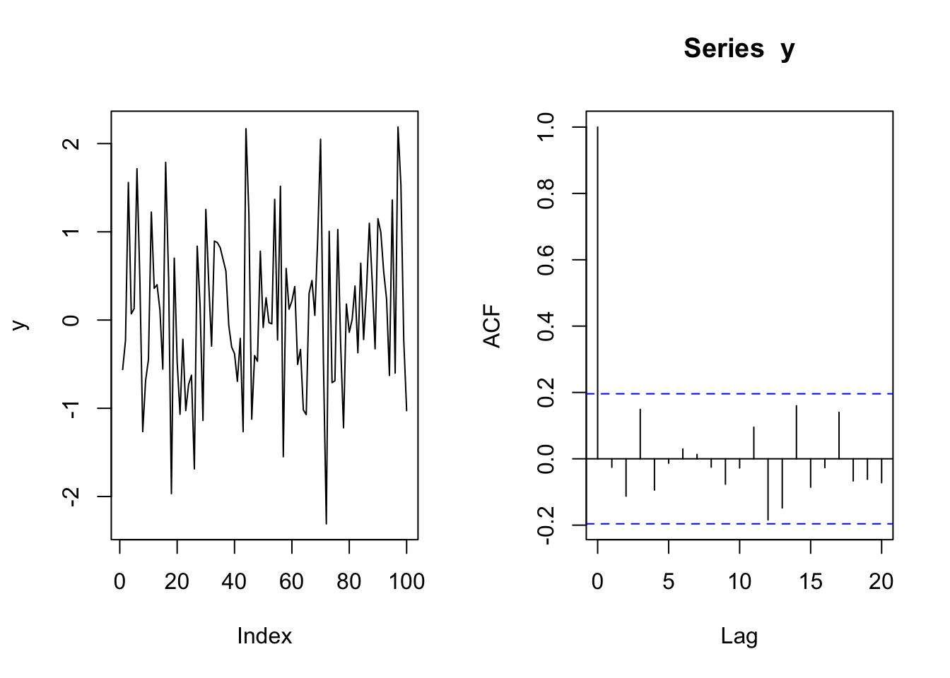
par(op)Here we use ggplot() to plot 10 white noise time series.
dat <- data.frame(t = 1:TT, y = y)
p1 <- ggplot(dat, aes(x = t, y = y)) + geom_line() + ggtitle("1 white noise time series") +
    xlab("") + ylab("value")
ys <- matrix(rnorm(TT * 10), TT, 10)
ys <- data.frame(ys)
ys$id = 1:TT

ys2 <- melt(ys, id.var = "id")
p2 <- ggplot(ys2, aes(x = id, y = value, group = variable)) +
    geom_line() + xlab("") + ylab("value") + ggtitle("10 white noise processes")
grid.arrange(p1, p2, ncol = 1)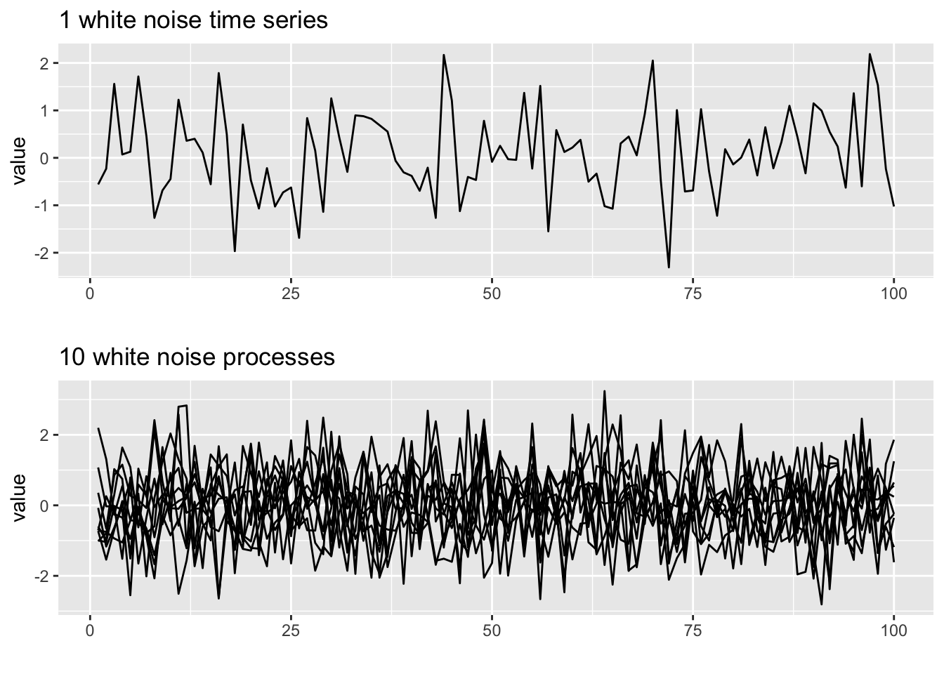
These are stationary because the variance and mean (level) does not change with time.
An AR(1) process is also stationary.
theta <- 0.8
nsim <- 10
ar1 <- arima.sim(TT, model = list(ar = theta))
plot(ar1)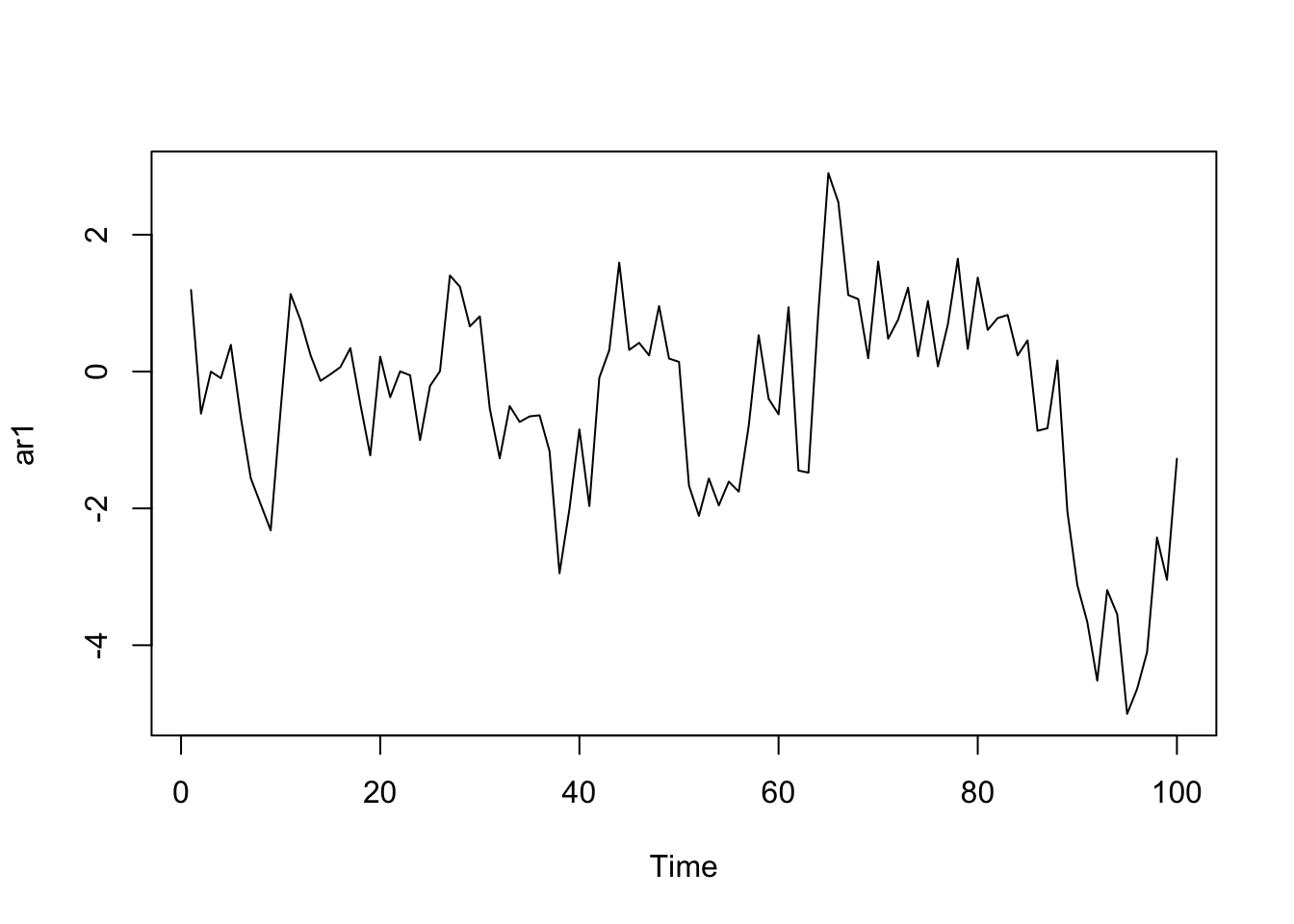
We can use ggplot to plot 10 AR(1) time series, but we need to change the data to a data frame.
dat <- data.frame(t = 1:TT, y = ar1)
p1 <- ggplot(dat, aes(x = t, y = y)) + geom_line() + ggtitle("AR-1") +
    xlab("") + ylab("value")
ys <- matrix(0, TT, nsim)
for (i in 1:nsim) ys[, i] <- as.vector(arima.sim(TT, model = list(ar = theta)))
ys <- data.frame(ys)
ys$id <- 1:TT

ys2 <- melt(ys, id.var = "id")
p2 <- ggplot(ys2, aes(x = id, y = value, group = variable)) +
    geom_line() + xlab("") + ylab("value") + ggtitle("The variance of an AR-1 process is steady")
grid.arrange(p1, p2, ncol = 1)
Don't know how to automatically pick scale for object of type ts. Defaulting to continuous.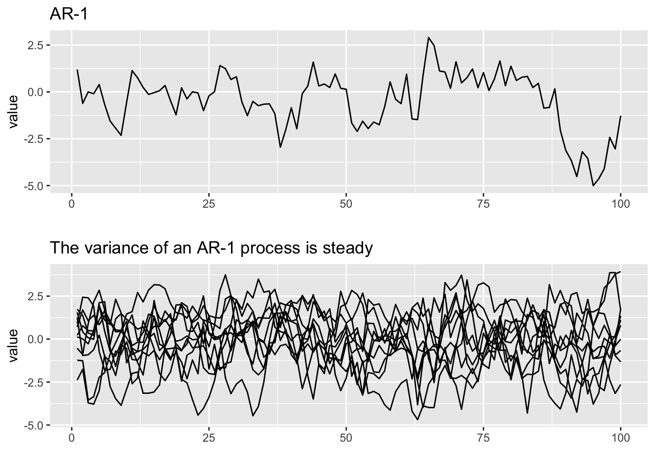
5.2.2 Stationary around a linear trend
Fluctuating around a linear trend is a very common type of stationarity used in ARMA modeling and forecasting. This is just a stationary process, like white noise or AR(1), around an linear trend up or down.
intercept <- 0.5
trend <- 0.1
sd <- 0.5
TT <- 20
wn <- rnorm(TT, sd = sd)  #white noise
wni <- wn + intercept  #white noise witn interept
wnti <- wn + trend * (1:TT) + intercept
See how the white noise with trend is just the white noise overlaid on a linear trend.
op <- par(mfrow = c(1, 3))
plot(wn, type = "l")
plot(trend * 1:TT)
plot(wnti, type = "l")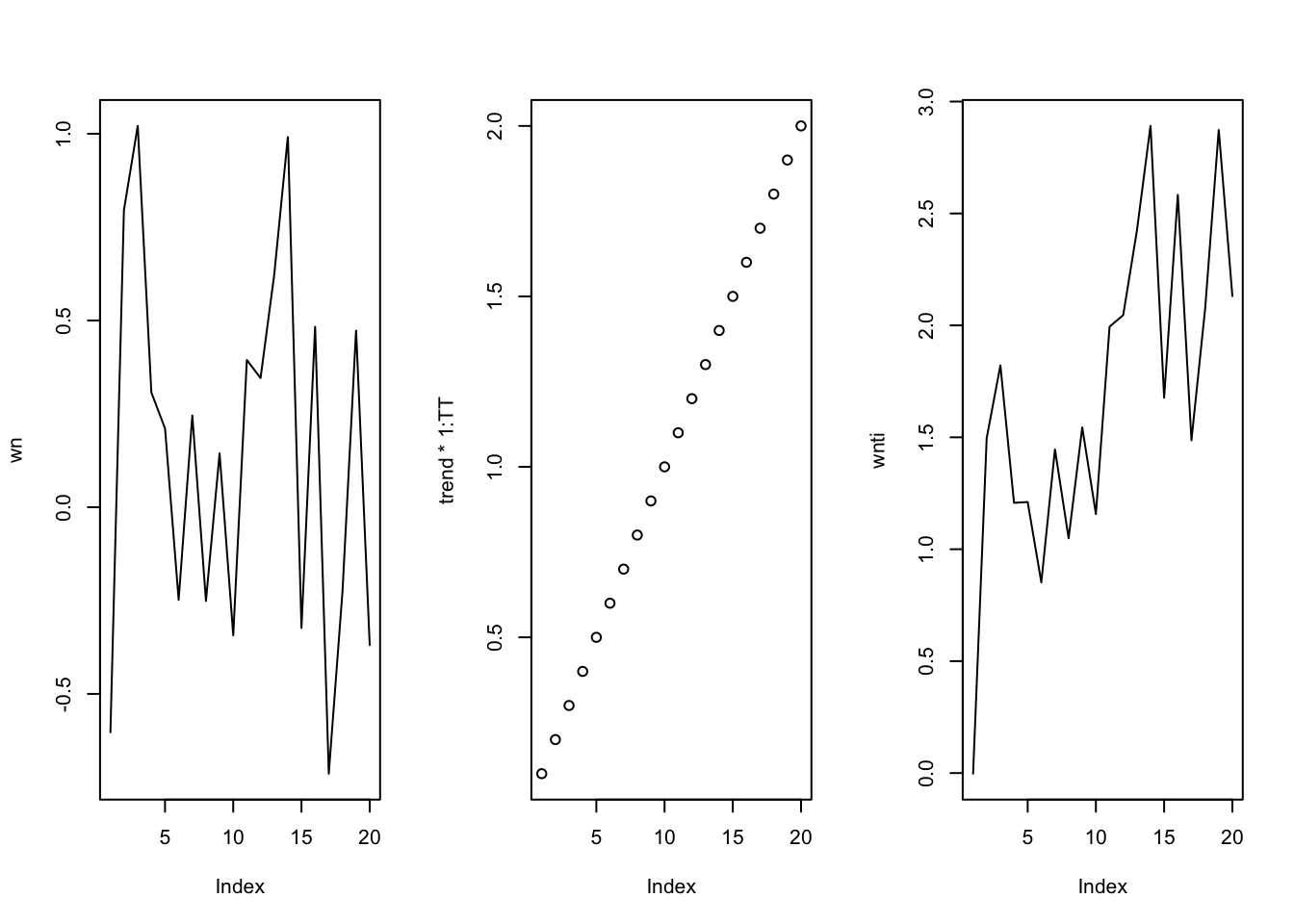
par(op)We can make a similar plot with ggplot.
dat <- data.frame(t = 1:TT, wn = wn, wni = wni, wnti = wnti)
p1 <- ggplot(dat, aes(x = t, y = wn)) + geom_line() + ggtitle("White noise")
p2 <- ggplot(dat, aes(x = t, y = wni)) + geom_line() + ggtitle("with non-zero mean")
p3 <- ggplot(dat, aes(x = t, y = wnti)) + geom_line() + ggtitle("with linear trend")
grid.arrange(p1, p2, p3, ncol = 3)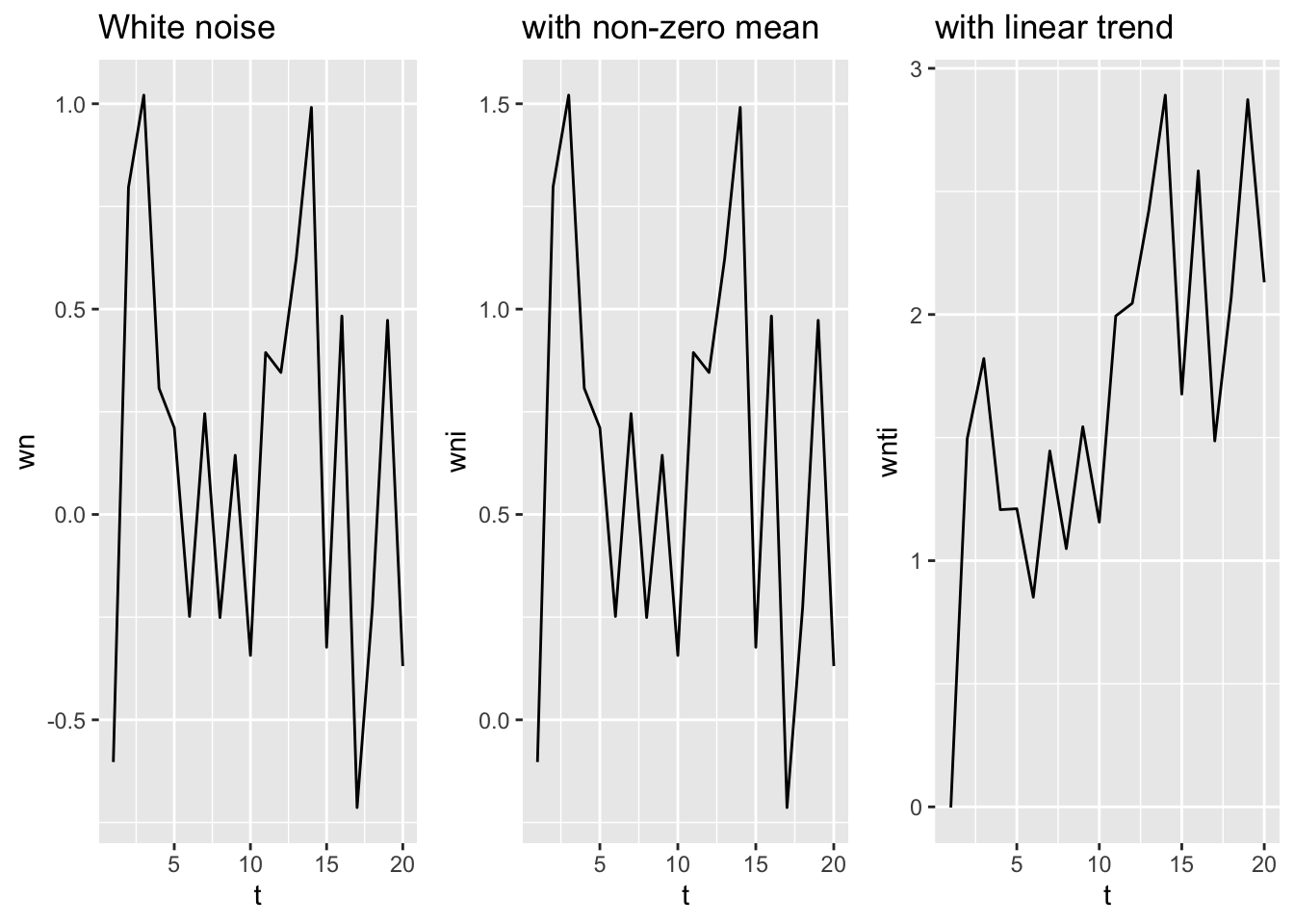
We can make a similar plot with AR(1) data. Ignore the warnings about not knowing how to pick the scale.
beta1 <- 0.8
ar1 <- arima.sim(TT, model = list(ar = beta1), sd = sd)
ar1i <- ar1 + intercept
ar1ti <- ar1 + trend * (1:TT) + intercept
dat <- data.frame(t = 1:TT, ar1 = ar1, ar1i = ar1i, ar1ti = ar1ti)
p4 <- ggplot(dat, aes(x = t, y = ar1)) + geom_line() + ggtitle("AR1")
p5 <- ggplot(dat, aes(x = t, y = ar1i)) + geom_line() + ggtitle("with non-zero mean")
p6 <- ggplot(dat, aes(x = t, y = ar1ti)) + geom_line() + ggtitle("with linear trend")

grid.arrange(p4, p5, p6, ncol = 3)
Don't know how to automatically pick scale for object of type ts. Defaulting to continuous.
Don't know how to automatically pick scale for object of type ts. Defaulting to continuous.
Don't know how to automatically pick scale for object of type ts. Defaulting to continuous.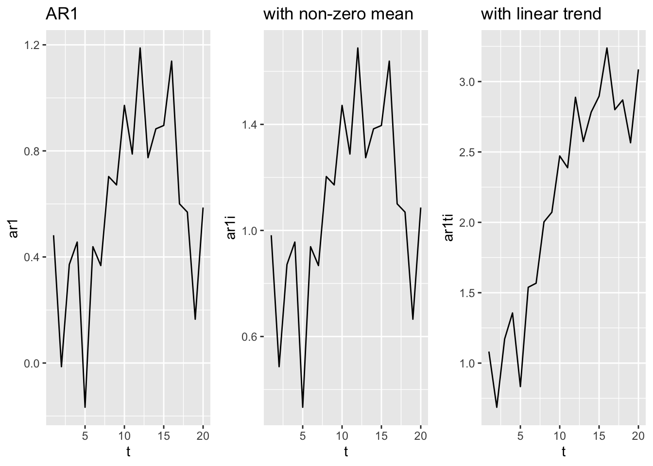
5.2.3 Greek landing data
We will look at the anchovy data. Notice the two == in the subset call not one =. We will use the Greek data before 1989 for the lab.
anchovy <- subset(landings, Species == "Anchovy" & Year <= 1989)$log.metric.tons
anchovyts <- ts(anchovy, start = 1964)
Plot the data.
plot(anchovyts, ylab = "log catch")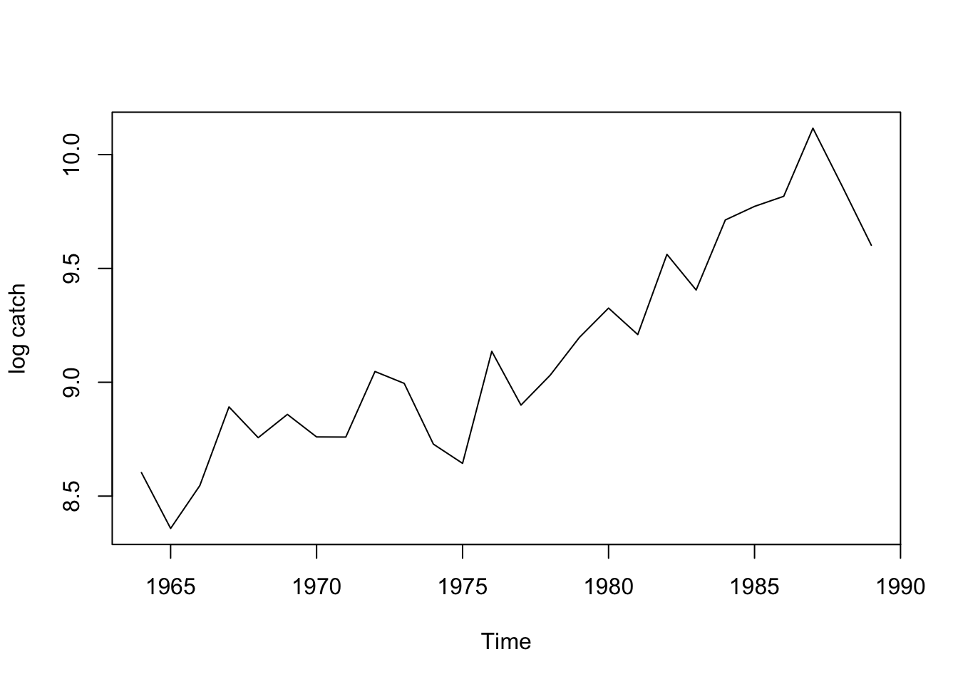
Questions to ask.
- Does it have a trend (goes up or down)? Yes, definitely
- Does it have a non-zero mean? Yes
- Does it look like it might be stationary around a trend? Maybe