14.4 Create data
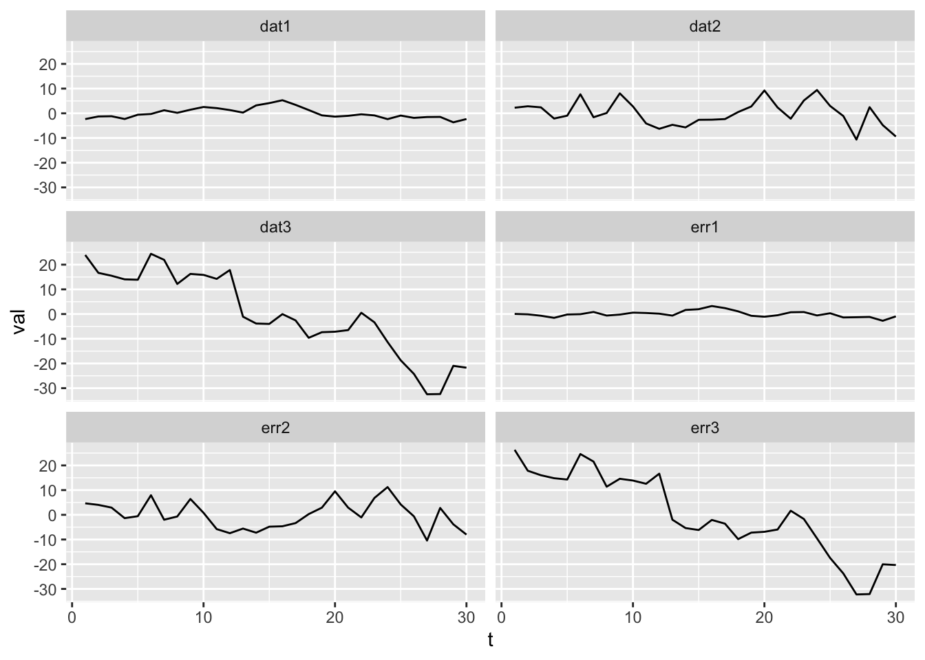
Plot the data and the error added to the signal by each sensor. The data is the error (on right) plus the signal. The signal is definitely not obvious in the data. The data look mostly like the error, which is autocorrelated so has trends in it unlike white noise error.
p1 <- ggplot(subset(df, name != "signal"), aes(x = t, y = val)) +
    geom_line() + facet_wrap(~name, ncol = 2)
p1